Your homepage gets the traffic, but your Product Detail Page (PDP) gets the sale. It's the final battlefield where a user decides "yes" or "no." Yet most e-commerce sites treat it as a simple template. Today, we're not just looking at the template; we're breaking down every psychological component that separates a 1% conversion rate from a 5% one.
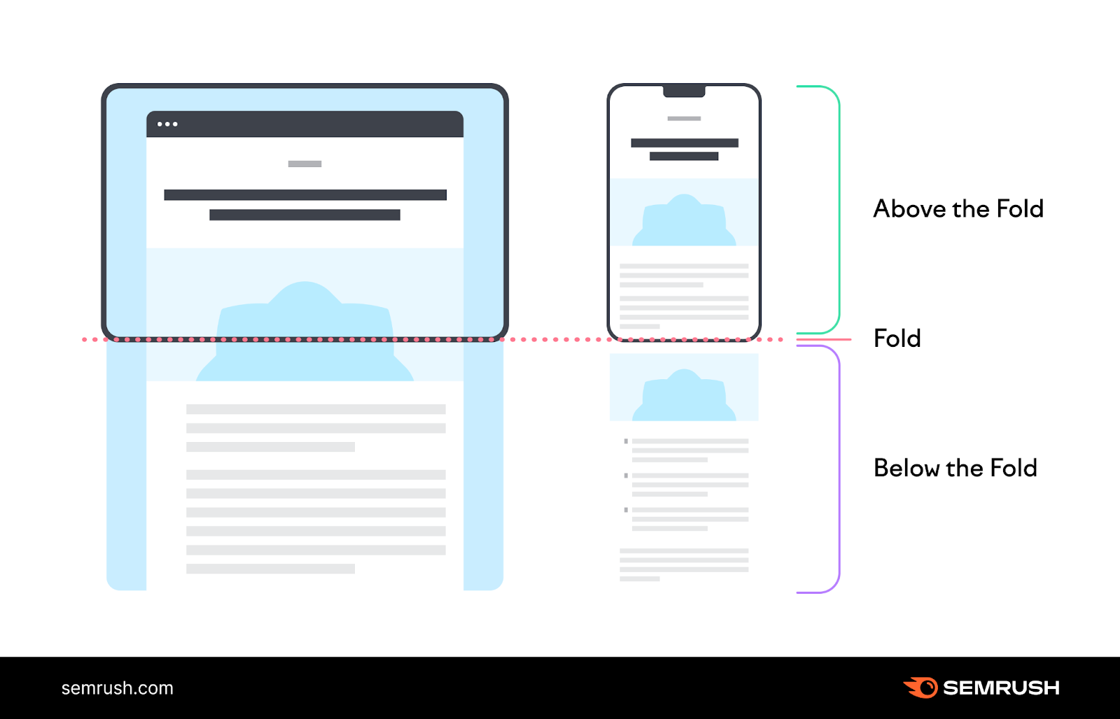
Part 1: The 'Above the Fold' Battle (First 3 Seconds)
This is what the user sees without scrolling. It must answer three questions instantly: "Is this the right product?", "Do I trust this site?", and "How do I buy it?".
Detail 1: The Image Gallery (Your Digital Salesperson)
Users can't touch your product. Your images must do the work. This is non-negotiable.
- High-Resolution & Zoom: Allow users to zoom in on texture and details.
- Multiple Angles: Show the front, back, side, and any unique features.
- Lifestyle/Context Shots: Show the product being used. A t-shirt on a model, a sofa in a room.
- Product Video: A 15-second video showing the product in 360 degrees can increase conversion by over 20%.
Detail 2: The Primary Call-to-Action (CTA)
Your "Add to Cart" or "Buy Now" button must be the single most obvious thing on the page. Use color, size, and contrast. If it blends in, you've already lost.
Detail 3: Social Proof (Above the Fold!)
Don't make users hunt for reviews. Show the star rating (e.g., ★★★★☆) and the number of reviews (e.g., "1,258 Reviews") directly under the product title. This builds instant trust.
Part 2: Building Desire & Urgency
Now that you have their attention, you need to convince them why they need it *now*.
Detail 4: Scarcity & Urgency Triggers
Fear of Missing Out (FOMO) is a powerful motivator. Use it honestly:
- Stock Scarcity: "Only 5 left in stock!" (Only if true).
- Time Scarcity: "Sale ends in 02:30:15" or "Order in the next 30 mins for free shipping."
Detail 5: The Product Description (Sell the Benefit, not just the Spec)
Don't just list "50% cotton, 50% polyester." Instead, write "A buttery-soft, breathable blend that stays wrinkle-free all day."
- Emotional Copy: A short paragraph that sells the *feeling* or *solution* the product provides.
- Bulleted Specs: Below the story, use clear bullet points for technical details (dimensions, materials, care instructions).
Detail 6: The Full Review Section
This is where hesitant buyers go. Make it easy to filter (by 1-star, 5-star) and show "Verified Purchase" badges. Allow users to upload their own photos with their reviews.
“A user photo in a review is worth 10 stock photos. It’s the ultimate, unbiased social proof.” — Head of E-commerce, ExampleStore
Part 3: Increasing Average Order Value (AOV)
The sale is almost made. How can you make it a *better* sale?
Detail 7: Up-Sells ("Buy the Better Version")
Subtly suggest a more premium version. (e.g., "Viewing the 32GB model? See the 64GB model for only $20 more.")
Detail 8: Cross-Sells ("Complete the Look")
This is the classic "Frequently Bought Together" or "You Might Also Like" section. If they are buying a camera, show them a camera bag and an extra battery. This is a service, not just a sales tactic.
Product Page Design Checklist
- ✅ At least 5 high-res images + 1 video.
- ✅ Star ratings visible above the fold.
- ✅ CTA button has high-contrast color and is instantly visible.
- ✅ Key trust signals (e.g., "Free Shipping & Returns") are near the CTA.
- ✅ Description sells the benefit, not just the feature.
- ✅ Scarcity or urgency trigger is present (but honest).
- ✅ Mobile-first design (button is easy to tap with a thumb).
Conclusion & Next Steps
A product page is not one single thing. It's a system of dozens of small, psychological details. By auditing your page against this list, you can identify the small "leaks" that are costing you sales. Don't try to fix everything at once. Pick the biggest problem (e.g., bad images), fix it, test it, and measure the results.


